Unit 32
G1: Understand the design and purpose of Television idents:
Analyse the purpose and design of TV idents. Select specific graphics and analyse them
Television Idents have been around since the early 1950’s, they were a way of identifying different channels by their logo in just a few seconds, since they didn’t have all the new technology that we have today idents used to just be black and white non moving images, the BBC’s first ident was recognisable and everyone nicknamed it ‘Bats Wings’, whereas now they have developed into colourful short films whether they are animated or real life imagery, that people can recognise to be with a certain channel as well as giving the audience some insight on what type of programmes the channel airs.
E4 has been a companion channel to Channel 4 since 2001; they are a entertainment channel aimed at people between the ages of 15-35 years old as they show programmes like ‘2 Broke Girls’, ‘Hollyoaks’, ‘How I Met Your Mother’ etc. The idents for E4 are mostly animated, some are a mix of animation and real life imagery, and some of them can be inappropriate for people who are younger than the target audience’s age. The first ever ident was of the E4 sign causing havoc breaking down the set and breaking the channel 4 sign which shows that E4 airs shows that are more inappropriate than what channel 4 airs. Since then they have developed to be more comedic and also have real life imagery involved in some of their idents.
G2: Understand the opportunities and limitations of onscreen graphic representation:
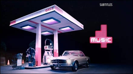
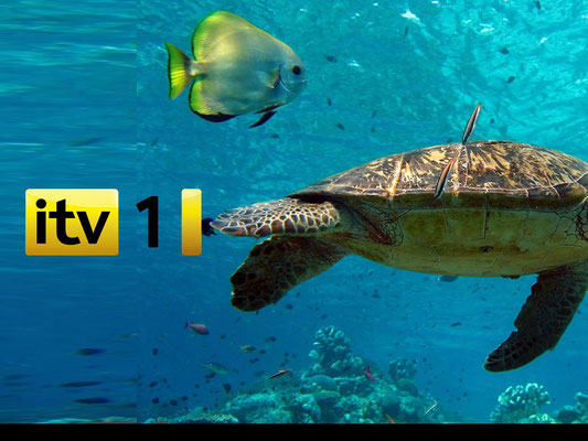
Opportunities- Idents are a way of promoting a TV channel, and also a way of showing what the channel has to offer for the target audience and a creative way of gaining more people watching that channel. When ITV was re-branded they changed their logo to be more colourful this is to show the wide range of different programming that they show, it also made it so they could make merchandise with this logo. 4Music idents are another good example as they are colourful and they always have two people dancing together to new music before showing the 4Music sign at the end, this is promoting that they play music and it is also goes with their target audience of 16-25 year olds.
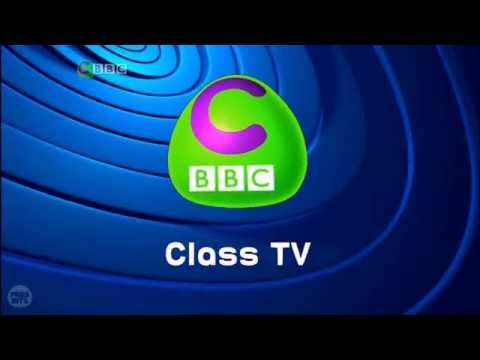
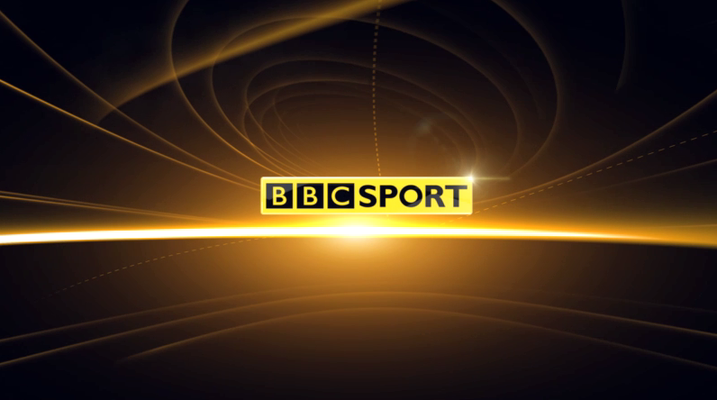
Limitations- There are some limitations when it comes to idents, the typography has to be readable to the audience as well as appealing to the eye so the audience can recognise it, but also it has to be reflecting what type of channel it is for example CBBC is a channel for young kids so the font for each letter is different with their signature colour of green around the letters, BBC Sports on the other hand is all in the same font and is big and bold surrounded by the colour yellow, it is a more serious logo. When logo’s are up on the screen they have to have enough time on the screen for the audience to read as well as if it is moving it has to be moving slow enough for the audience as if it is going too fast it will be too blurry and hard to read. The size is also a big thing as you want to make sure that the whole logo fits into the screen of the television as some people have smaller televisions so they can be cut off to, the aspect ratio is for televisions now are 16:3-4:3, which means the logo has to be between those two otherwise people won’t be able to read them without it getting cut off the side on the screen.
Consider how creative communication is used within on screen graphic representation
Creating under pressure of time and budget - Graphic designers have deadlines for when the idents are needed in order to broadcast them on television. If designers lose track of time and don’t meet the deadline or rush any of the pre-production processes, it does not only affect them but the whole production. A budget also pressurises designers because they are limited to how far they can go with the high quality resources or whether they only have enough money for low/middle quality resources. Bigger budgets are ideal because designers do not have to be cautious about using particular resources- which will create a higher quality project.
Communicating visual ideas to a non-visual audience- Idents are mostly made up of visuals and this better appeals to audiences when various colours, animation and special effects are used. Technology allows us to spread this visual information quicker and easier, as idents are quite short in duration but still convey a brand identity, their aims and values. The music choice is very important, as this will allow the visually impaired viewers to engage with the ident as they cannot engage visually. As well as this, catchy theme tunes that are recognisable to different channels allow both visual and non-visual audiences to remember the channel.
Appealing to a target audience- It is important that idents appeal to their target audience because that is who they want to watch this particular channel which will reflect on what kind of people will like the programs shown. Idents establish a company and aim to portray a company via on-screen graphics such as idents.
Enhancing ideas and pushing technology - The availability of new and up-to-date software allows you to creatively convey your ideas, which was almost impossible to achieve in the past, because of the lack of technology.
Lambie Nairn created the floating puzzle ident for Channel 4, it uses our natural inquisitiveness as humans to watch the pieces form the puzzle together and make the ‘4’. Once it is finished, the viewers are left thinking how much work must have gone into creating it, by the time the audience have thought about this the ident is over and the program has already started, meaning that it is highly likely the viewer stays and watches it. This ident is very clever in that respect and the initial idea of it has been enhanced through the push of technology. The floating puzzle ident is still used today for Channel 4 idents but a development over the years shows that it has had creative enhancements made to it to make it look more visually dynamic.
Appreciation of desired tone- A designer has to take into consideration what desired tone he/she is using to communicate with the audience. If the tone is not communicated effectively to the audience or is conveyed in the wrong context, this will result in a decrease in viewing figures.
BBC aim to appeal to a mass audience so it is difficult for all audiences to appreciate the various tones of BBC brand identities. However, because each tone is different, each tone works well for a different audience - this is used to reflect how varied the programs shown on this channel are.
G3: Be able to originate and plan Television idents to a brief:
Produce planning: production budget, timescales, management and roles etc.
Production Budget
Equipment list/Budget-
Camera (Nikon d3300)- £279
Tripod- £15
Computer (Dell OptiPlex 3030)- £505
Actors- £15ph
Camera- £21ph
Total- £835 minimum
Timescales
| Task | Time given for task (days) | Time taken |
| Gathering instruments for image | 1 | 1 |
| Taking image | 1 | 1 |
| Editing | 5 | 1 |
| Draw storyboard and plan | 2 | 1 |
Job Roles
Management and roles-
Photographer- Reece (Me)
Editor- Me
Equipment gatherer- Me
Rough Storyboard- Abandoned
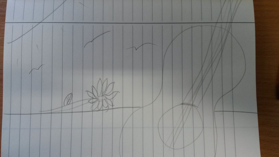
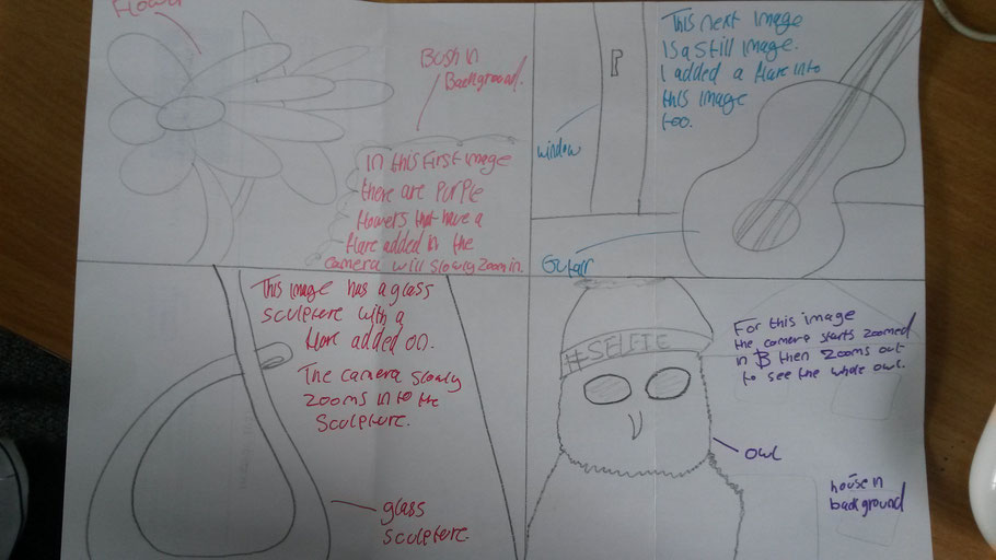
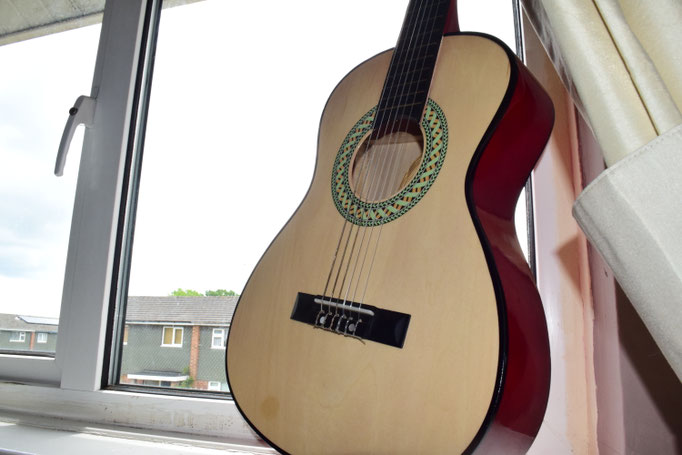
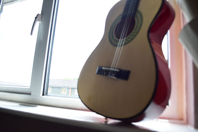
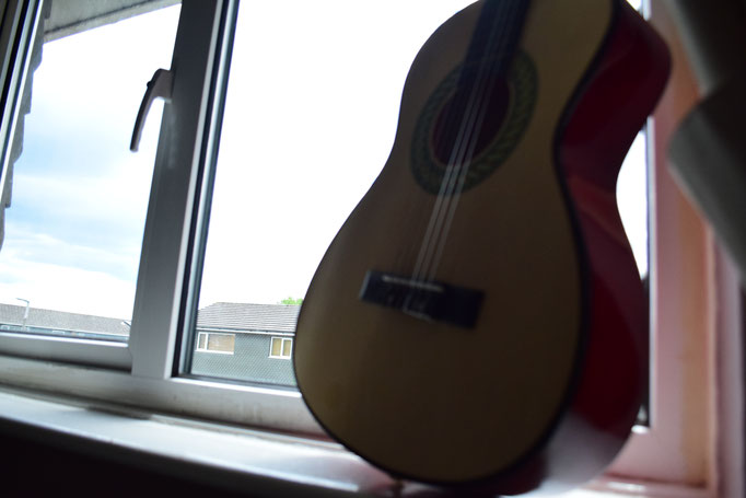
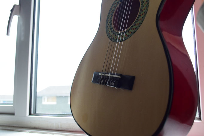
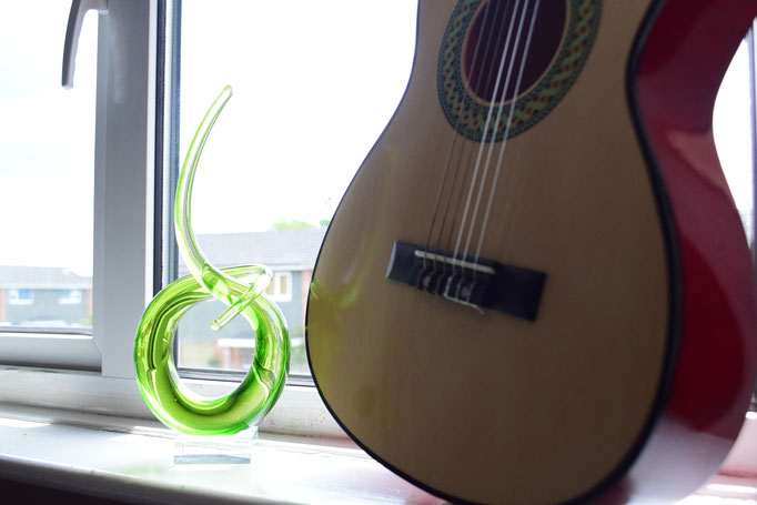
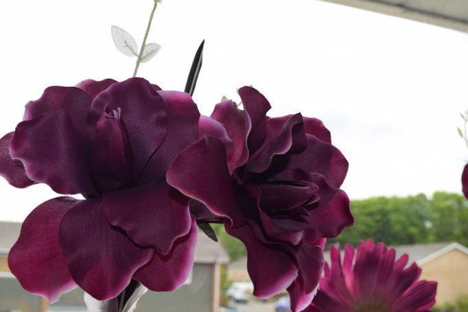
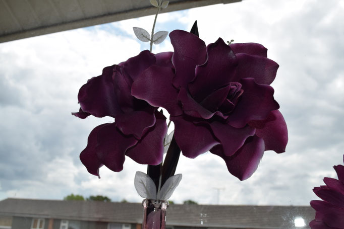
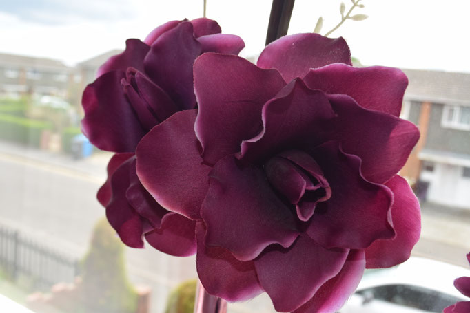
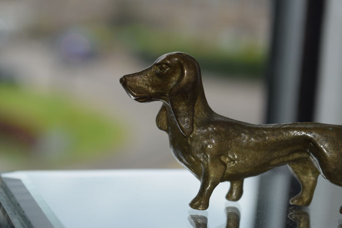
This storyboard contains a guitar, flower, a few birds and the sun. I may add look at adding the tops of a few houses near the bottom of the page.
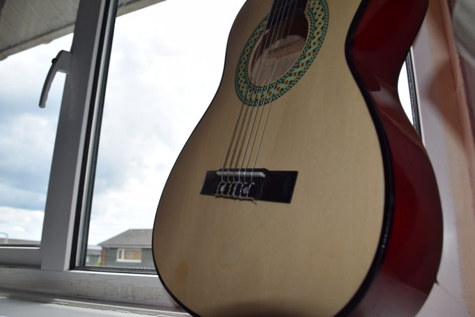
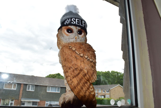
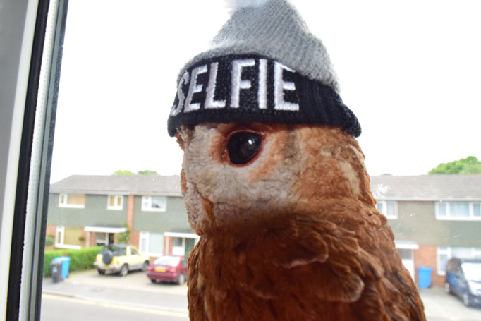
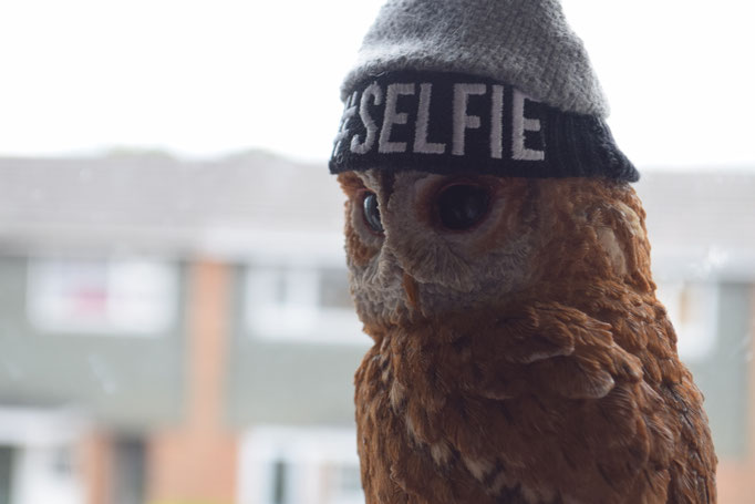
I was unable to get the image with the guitar that wanted so the i just ended up taking pictures of things that I thought looked cool and interesting around my house. With the images I took of the Owl I could use one of these images for my ident and make a music channel aimed at people aged 12-24. I have drawn a new storyboard (please excuse my drawing) below this is the one I will be using.
Channel name- #HIPMUSIC (#HM for short)
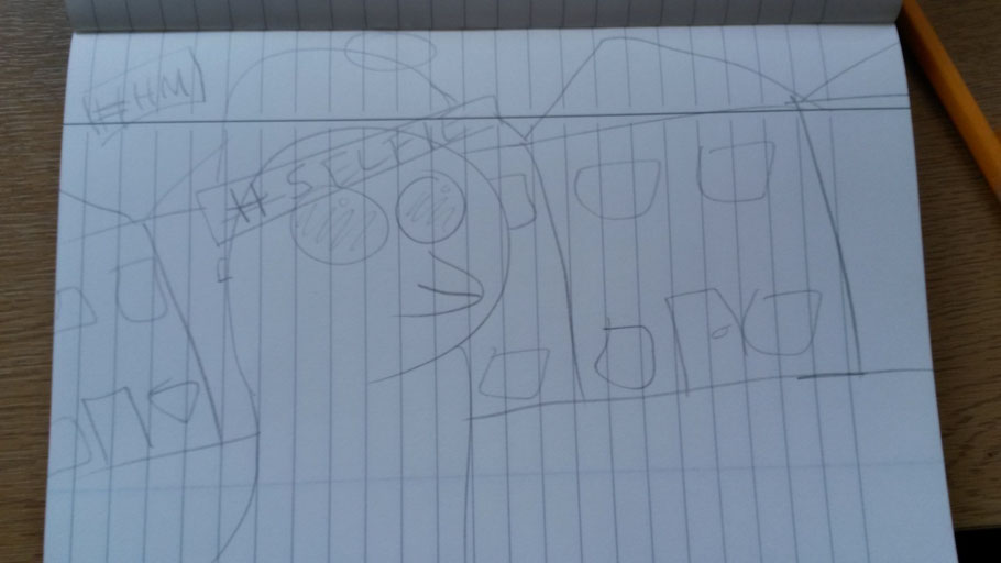
My new story board contains a owl with a hat on as this is more engaging than just a guitar and a flower, I came I with this new idea when taking the images for my old storyboard, if I'm completely honest i got bored and took a random image and decided that I liked it so I changed my storyboard to fit the image in.
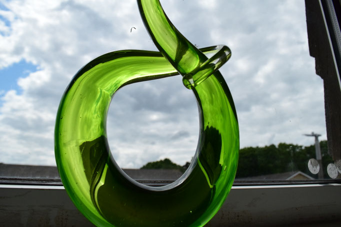
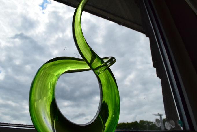
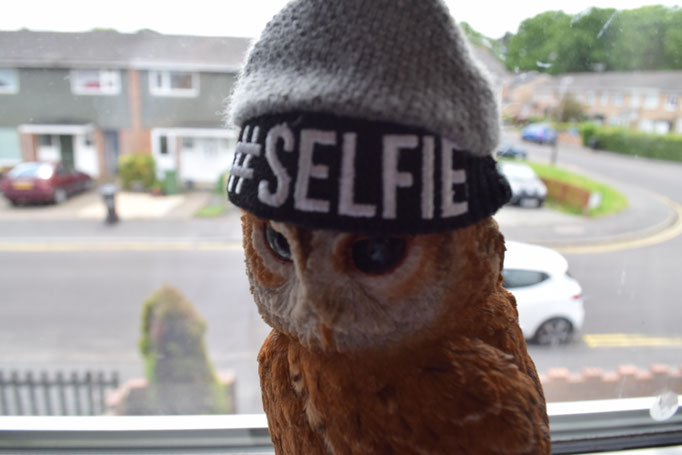
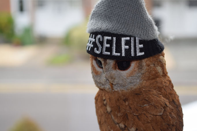
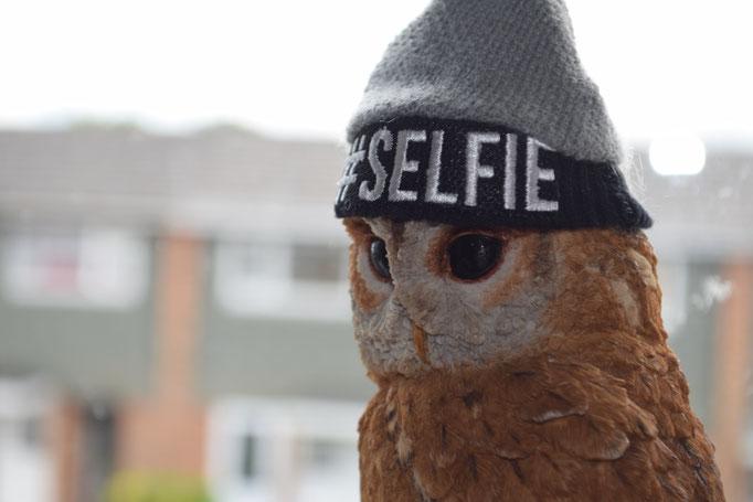
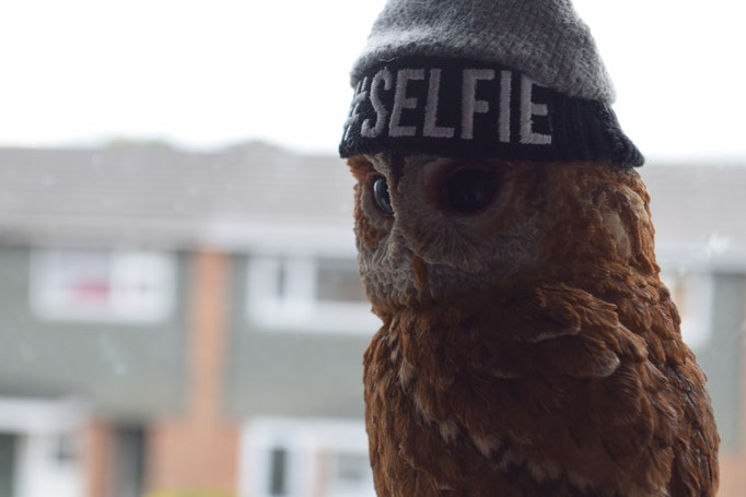
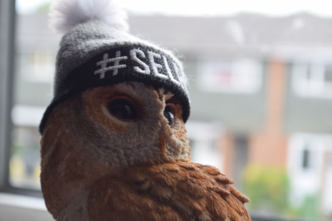
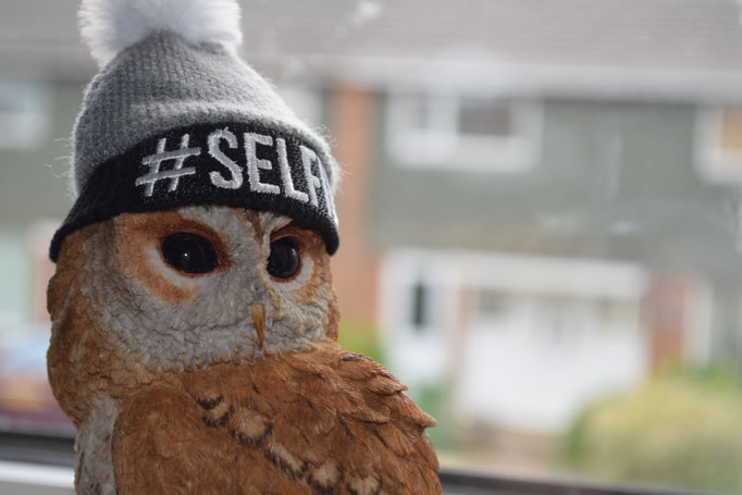
Trial Images
Below are all of the images I took as my trial pictures for my ident. I ended up liking one of the pictures so much after I had edited it I decided to use that image as my actual ident image.
Evidence design process - inc. storyboarding, timing animation sequences, rough and final designs, expansion/reduction of concept to form a suite of idents
| Location | Risk assessment (and how to prevent hazard) |
| My house- Spare room |
1. Tripping hazard- wires etc. (Move all wires to one side and just keep looking where you're walking/stepping).
2. Heat- risk of getting too hot (Air the room out before hand e.g. leave door and windows open).
3. Falling objects (Just be careful not to knock anything over). |
G4: Be able to produce a television ident to a brief:
Consider usage of 2D vs 3D, stop motion and layering - choose one of these to create ident
I considered making my ident 2D but I could not think of anyway in which to use it so instead I just used a 3D image for my work instead.
When thinking about using stop motion which was suggested to me I couldn't think of anyway to use it. I didn't know what characters to make or even have a story. I don't think I would have used stop motion even if I did have an idea, because I would not be able to get hold of the equipment i needed in order to make a stop motion ident.
When making my ident I actually thought of layering because I know how to use layering and had an idea in which I could use it. In the end I actually use layering for the Owl is on a different layer to the TV logo in the top left corner.
Evidence editing/digital manipulation
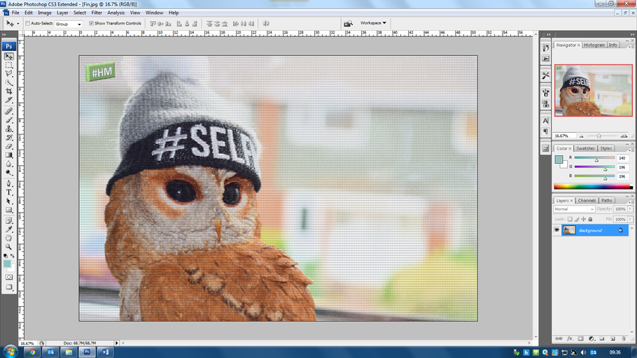
I used Photoshop to edit the image to look the way I wanted. I also added a logo for the channel in the top right corner of the image.
Evidence production management documents and professionalism
This is the folder in which I stored any progress I made when making my ident.
My Ident- OLD
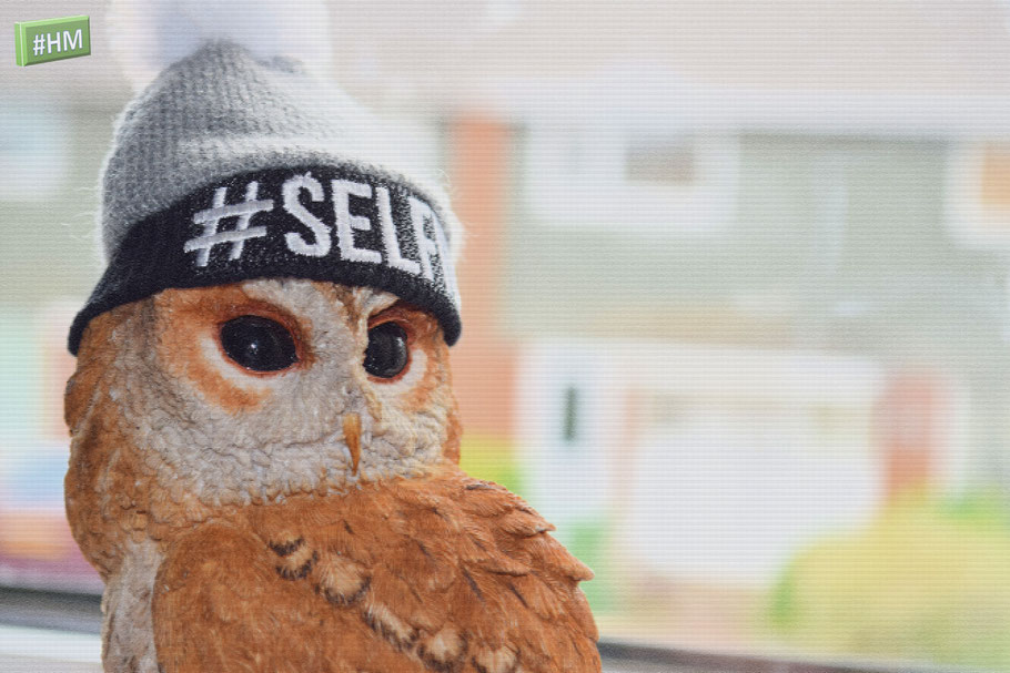
This is a still ident meaning that the image will not move, the only thing that would move with this on the screen would be names and times of what is being shown on the channel. In the top left-hand corner I have included a logo for the tv channel, this logo would stay on the screen the whole time, even when shows are playing so you know what channel you are watching. Whiles a show is playing the logo would be more transparent and will only just be visible so the show does not have a bright green box on it all the time.
Old Ident
I improved my ident by making it into a small video. When editing my images I layered my original image underneath 4 different lense flares (one for each picture), then I edited the first image in such a way that the flare doesn't look extremely out of place. Once all of the images were edited I placed them all into some editing software in order to make them into a video. After I had added the images into the software I found some music that I thought would fit the theme of the channel and placed a short section into the video, I also added transitions in between the images to make the video flow better.
New
Not much has changed in this version of my video except that now i have added zooming in and out.