Unit 2
G1: Be able to extract information from written sources:
Extract information from a range of resources regarding the research of the project you are going to undertake and create a collage. You should also annotate the articles/images identifying what you have learned from them.
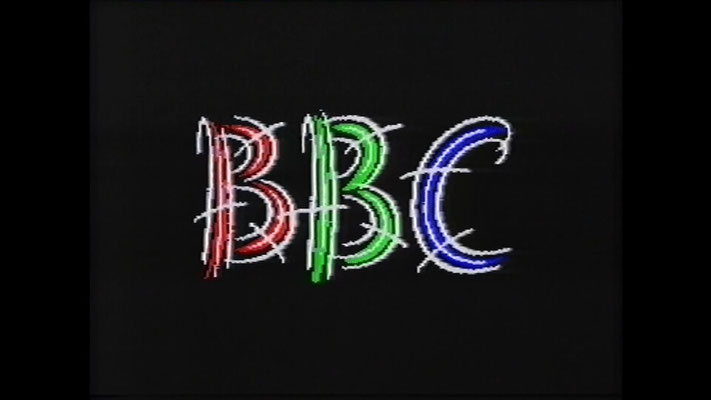
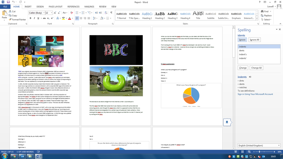
'CBBC was originally launched as Children's BBC in September 1985 as a strand of programming for children aged 6–13. The first idents consisted of Children's on top of a large BBC is a similar style to a rushed scribble, generated live on air by a BBC Micro computer. However, 2 years after launch, the idents were replaced by an animated sequence of the letters spelling out Children's with an outline of an object corresponding to that letter. This was replaced by a computer generated sequence in 1990.
In 1991, the BBC corporate revamp meant that Children's BBC was given a makeover. The result was a logo centred on a stylised Children's with a corporate BBC logo at the bottom of the screen. In 1994, the Children's BBC idents changed in style; many featured cartoons or computer generated graphics where the stylised Children's and the BBC corporate logo would feature somewhere.
Children's BBC was officially renamed CBBC in October 1997, with the production of appropriate idents. The idents all had a yellow background, and black subjects and often in the cartoon style. When CBBC was given its own channel on the digital terrestrial platform on 11 February 2002, the CBBC "blob" ident was created. These animated 'bugs' were designed by Lambie-Nairn, and were always green in colour. The blob was later refreshed and given a 3D appearance in 2005.
CBBC relaunched again in the autumn of 2007, with a new logo revolving around the letters of CBBC, each in a different style. A new set of idents followed these up, revolving around scenes including each of the 4 letters before coming together at the end. These scenes could involve cartoon figures, or stars of current CBBC programmes. In 2010 the logo was updated to look more 3D. These idents were changed on 13 September 2014.'
The test above was taken straight from the internet so that I could analyze it.
The first ident that CBBC had looked like it was made by a child with some chalk and coloring pencils, even tho this ident does what it is supposed to (show that this is a different channel and designate it to a certain type of audience) it lacks certainty. When looking at the ident you may take a bit of time to figure out that this is a kids tv channel just by looking at the ident.
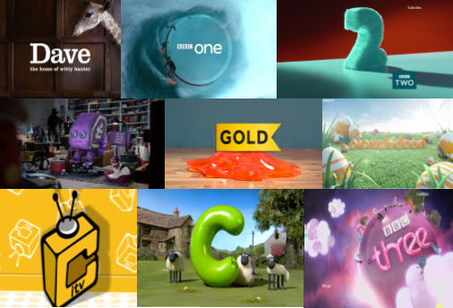
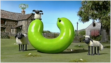
When you look at what the idents are like today you can clearly tell that the show is for younger audiences because of the color and the childish themes such as the image above with 'Shaun the Sheep'.
From looking at how much CBBC's TV ident has developed I can see how much I could improve my ident for a channel. I could do this by trying to do something animated or draws and see them change on the screen.
1981[edit]
When ITV was incepted in 1958, most of the franchises had their own individual logos and identities, and were created by the franchise holders for their own use and identification within the network. From 1981, a generic, 'blocky-looking' logo was used infrequently throughout the 1980s, often in a rainbow colouration for promos produced by the "Big 5" franchises (Thames Television, LWT, Granada Television, Yorkshire Television and ATV/Central Television), as well as holding slides used by some of the regions and Channel 4 (for cross-promotion purposes), but it was never used as the centrepiece of an identity.
1989[edit]
A new generic ITV logo was introduced on 1 September 1989 and accompanied a first-time, national on-air identity designed by English Markell Pockett with music by Lord David Dundas. The logo was the centre of a whole branding package; there was a national logo and regional logos for all of the ITV franchises. Each franchise had a distinctive portion of their logo included into the V of the ITV logo. The ident was generally formed by beginning with the franchisee's logo, then going into a sliding sequence featuring a dove, a couple in period dress, Big Ben, an athlete, and a pair of dancers before the regional ITV logo is formed. Along with this, each franchise received a regional clock, trailer style, network font and break bumpers.
- 1989 ITV Brands
However, this new look did not go as the designers intended:
- Anglia Television, Channel Television, TVS, TSW and Ulster Television refused to use the new ITV identity presentation package. The logo however appeared on network trailers, end-boards (the company who made the programme or feature) and at the start of some networked programmes (such as Morning Worship).
- Granada Television and Central Television used versions of the ident altered to suit their normal branding package.
- Yorkshire Television's moving ident was altered in 1991 so that their 'chevron' logo appeared full in place of the triangle shape and zoomed into the centre of the screen at the end of the ident, a different font was also used.
The look was dropped at various times depending on region:
- Scottish Television used the ident in conjunction with its own, but then dropped it by December 1989.
- Central Television included the ident as a variation of their branding, and gradually phased out by 1993, being replaced with their own package.
- Granada Television had dropped their altered ident look in 1991, being replaced with their own package.
- Thames Television ended the 1989 package entirely, a few weeks after losing their franchise in 1991. This included trailers, holding slides, and created their own ident and presentation package.
- Tyne Tees Television returned to their own new-look package around 1991, but reused the music in subsequent idents.
- LWT ended the package after the 30th August 1992. LWT used a remixed version of the 1989 theme in the new ident which retained a smaller version of the ITV logo, and revived the 1986-89 Solaris ident for use in regional programmes.
- HTV launched with their own presentation package on New Year's Day 1993.
- Border Television ended in early September 1993 but reused the music in their own subsequent idents.
- Yorkshire Television ended the package in early October 1994 and used their own versions.
- Grampian Television continued to use the 1989 generic ident right up until ITV's new corporate logo was introduced in October 1998. They had also been taken over by SMG at this point.
January 2013 – present[edit]
On 15 November 2012, it was announced that ITV1 was to receive a rebrand in January 2013, in which it would revert to its old name of ITV. A new "curvy" logo was introduced with new idents and presentation package. This was first implemented on 14 January 2013. On the same day, ITV1 +1 and ITV1 HD were rebranded to ITV +1 and ITV HD respectively, whilst sister channels ITV2, ITV3, ITV4 and CITV all received new idents and presentation based upon the new corporate logo (later two new channels based on the 2013 ITV logo, first ITV Encore from June 2014, and then ITVBe from October 2014 were also joined the sister channels).
ITV's new idents were created to reflect "everyday life of the Great British public". New idents will be brought in on a consistent basis to reflect the four seasons - Spring, Summer, Autumn, and Winter. In addition, the new ITV logo changes colour on each ident, a process named as "colour picking".
This package is only seen on the ITV plc owned companies of Anglia, Border, Central, Channel Television, Granada, London, Meridian, Tyne Tees, Wales (Later ITV Cymru Wales), West Country and Yorkshire.
UTV, refused to adopt the look, instead continuing with their in house produced landscape idents introduced in October 2012. However in 2016 following the takeover of UTV by ITVplc, UTV will launch a new logo and a new on air look to match ITV's 2013 branding. STV Group companies of STV Central and STV North, refused the look, instead continuing with their arrow flip book idents introduced in March 2009.
These are the idents to have been featured so far:
The test above was taken straight from the internet so that I could analyze it.
The first ident for ITV in my opinion looked more like a logo of some offices for a bank in the 60's, that's what I think of when I see the logo. For its time the logo was well designed for its time but compared to its present day equivalent it is a very crude and bland design.
The present day logo in my opinion is a lot better than the original for a few reasons.
1- There are more than 2 colors
2- It doesn't look like an boring and dull
3- The font looks more appealing and welcoming
From looking at the comparison between the first and the most recent ITV idents I can see that my ident will have to be colorful in order to not bore any viewers.
G2: Be able to create a report in a Media Production Context:
Undertake relevant quantitative and qualitative market research for your project, produce a market and a self analysis to include in your report.
Quantitative-
Qualitative-
Create a detailed report (15 pages minimum). Pdf using relevant linguistic register, illustrative material inc. graphs outlining proposal of idea, a s.w.o.t analysis, progress, potential limitations and strengths of project - report is aimed at the client.
Evidence proof reading including making changes to grammatical errors, spelling and language register within document.